Design Systems
Design Systems
Role:
Team Lead
Sr. Product Designer
Tools:
Figma
FigJam
Variables


What was the issue?
I worked on a large, cross-platform product, but our design process wasn’t keeping pace. There was a lack of consistency across components that led to:
Inconsistent user experiences across platforms.
Redundant design work, as teams re-created UI patterns.
Developer frustration due to unclear specifications.
A longer time-to-market for new features.
We needed a design system to unify our brand, save time, and scale with the product.
What was the issue?
Myself and another designer led the design system initiative, collaborating with the rest of the design team, the engineering team, and the product owners. My responsibilities included:
Audit and Analysis
I conducted a comprehensive audit of our existing UI. This included reviewing screens across web and mobile platforms, noting inconsistencies, and identifying common patterns.
I interviewed engineers and product managers to understand pain points in the current workflow.
Defining Principles
To guide the system’s development, I established these principles:Consistency: Every component should adhere to our brand guidelines.
Scalability: The system should evolve with the product.
Accessibility: WCAG compliance would be non-negotiable.
Developer-Friendly: Documentation and specs should empower engineers to implement quickly.
Component Library
Foundations: I started with typography, colors, and spacing, defining tokens that could be reused across components.
Components: I worked with the team to design reusable components like buttons, form fields, and navigation bars. Each component was built with scalability and responsiveness in mind.
Tools and Documentation
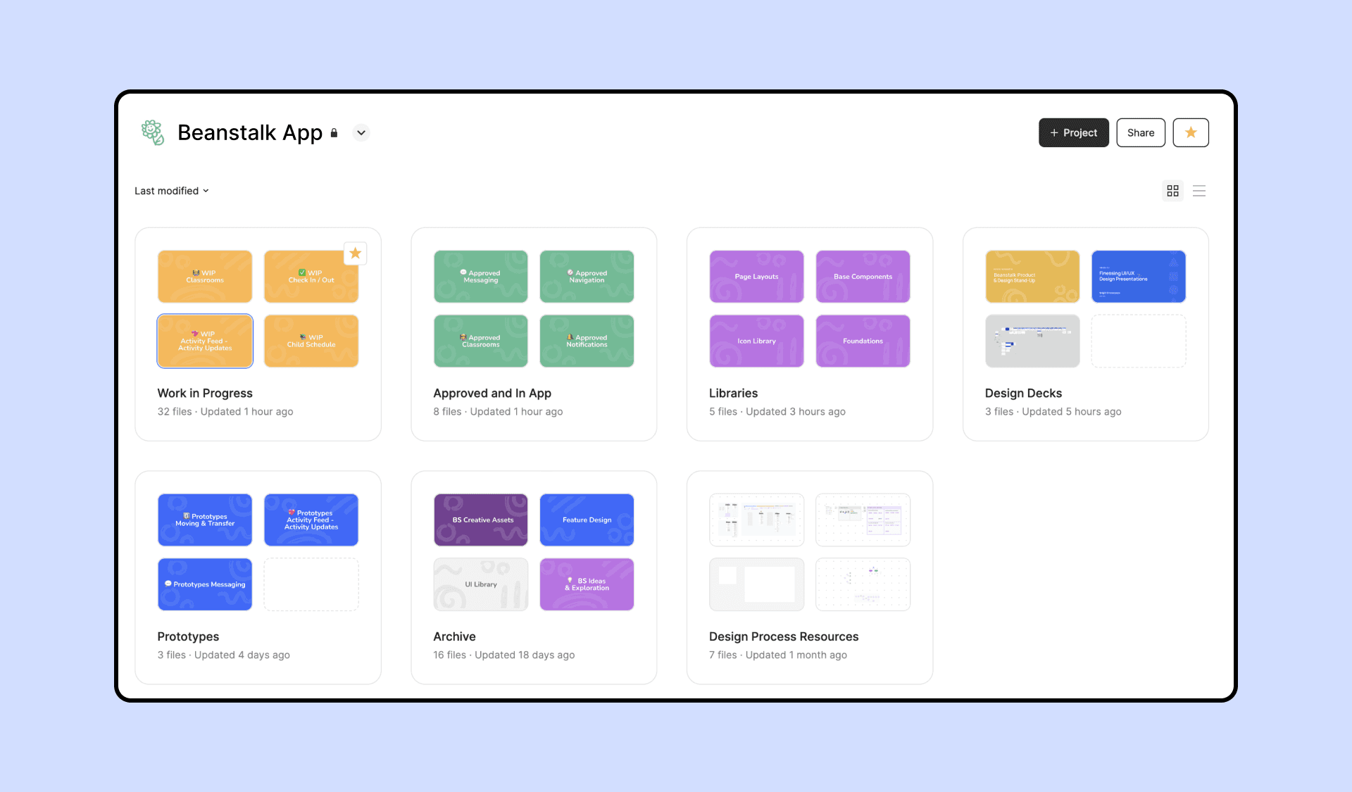
Figma Library: I created a Figma library, ensuring components were accessible to all designers.
Documentation: I wrote clear guidelines for each component, including examples, as well as dos and don’ts.
What was the issue?
Myself and another designer led the design system initiative, collaborating with the rest of the design team, the engineering team, and the product owners. My responsibilities included:
Audit and Analysis
I conducted a comprehensive audit of our existing UI. This included reviewing screens across web and mobile platforms, noting inconsistencies, and identifying common patterns.
I interviewed engineers and product managers to understand pain points in the current workflow.
Defining Principles
To guide the system’s development, I established these principles:Consistency: Every component should adhere to our brand guidelines.
Scalability: The system should evolve with the product.
Accessibility: WCAG compliance would be non-negotiable.
Developer-Friendly: Documentation and specs should empower engineers to implement quickly.
Component Library
Foundations: I started with typography, colors, and spacing, defining tokens that could be reused across components.
Components: I worked with the team to design reusable components like buttons, form fields, and navigation bars. Each component was built with scalability and responsiveness in mind.
Tools and Documentation
Figma Library: I created a Figma library, ensuring components were accessible to all designers.
Documentation: I wrote clear guidelines for each component, including examples, as well as dos and don’ts.
What was the issue?
Consistency: Our product's UI became more cohesive across web and mobile platforms.
Efficiency: Design handoffs became smoother, reducing developer rework.
Scalability: Teams now have a single source of truth for new features.
Building this design system was a lesson in collaboration, communication, and scalability. While the process wasn’t without its challenges—like managing stakeholder expectations and balancing day-to-day feature work—the result was a system that empowered the entire team.
Looking ahead, I’m excited to see how the system evolves and continues to support the growth of the product.